The Multi-talented Brian Pinkney


Brian Pinkney's art was some of the first I saw this year. Busy-Busy Little Chick chirped at me from the booth at ALA last summer, and I was smitten. While Little Chick might not be as sparkly and complicated as some of the other books we have talked about this year, it still is worthy of discussion. Janice Harrington has a way with words, and no doubt her jaunty language inspired Pinkney's gestural, movement-filled watercolors. The traditional tale, from the Nkundo people of Central Africa, is a bit of a reverse "Little Red Hen" story. Instead of building a sturdy house for her family, Mama Nsoso is distracted by tasty worms, crickets, and corn. Fortunately, her dedicated littlest baby chick ignores the food and collects leaves and twigs, grass and mud, and builds a warm house for the whole brood. The lesson is, I suppose, that if you want something done, you'd better do it yourself.


What I liked:

  • strong black (watercolor? India ink?) outlines of Mama Nsoso and the chicks, especially when they are cuddling together

  • action-filled gestural drawings

  • white space when the Little Chick works by himself and when the family is out and about during the day

  • the way Pinkney captures the busy-ness of Little Chick's feet when he is collecting mud

  • nighttime scenes painted on paper saturated with the background colors

  • the helpful author's note and glossary for those unfamiliar with the use of sounds ("cwa-cwa-cwa"; "tee-tee-tee") in this type of storytelling


What I am concerned about:

  • the paper is not thick enough to handle the dark watercolors, and this distracts the eye. Even the text on the next page is easily seen through the paper

  • most of the illustrations mirror rather than extend the text
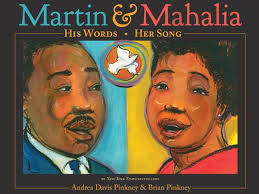


And then, as we were putting our list together this fall, Sam Bloom brought Martin & Mahalia: His Words, Her Song (written by Andrea Davis Pinkney) to our attention. (This is what Sam said: "MARTIN AND MAHALIA wipes the floor with BUSY LITTLE CHICK.") I had not seen it and quickly made sure I did. This beautiful volume is sure to become a staple on the Martin Luther King Jr. shelves and will help introduce today's children to role of Mahalia Jackson in the civil rights movement.

What I liked:

  • the use of color: rich blues and greens for King, deep reds and oranges for Jackson, purples and magenta when King and Jackson are on the page at the same time

  • the path that begins before the title page, introducing the map and path motif that is a big part of the story

  • the white dove that appears on just about every spread, flying across the pages, leading the reader to each page turn

  • Bolded words in the main text reflect the words in many of the paintings

  • India ink outlines of the foreground scenes juxtapose with the lightly painted background scenes

  • circles everywhere (acting as halos?)

  • six pages of backmatter, including bibliography, discography, timeline, and discussion of the art


What I am concerned about:


  • some of the handwritten words in the illustrations are hard to read, especially for the child reader who may be unfamiliar with cursive or stylized uppercase letters ("I've been 'Buked and I've Been Scorned" is hard to read and then explain to the youngest listener, especially when compared with the clarity of presentation of the spread featuring King's words "I Have a Dream")

  • the two vertical spreads are jarring, taking the reader out of the rhythm of the story to turn the book ninety degrees and then back again


So, Sam Bloom and everyone else, go on and add your smart ideas to the discussion. There is much more to say, despite this ridiculously long post.


Robin Smith
Robin Smith
Robin Smith is a second-grade teacher at the Ensworth School in Nashville, Tennessee. She is a reviewer for Kirkus and The Horn Book Magazine and has served on multiple award committees.
Comment Policy:
  • Be respectful, and do not attack the author, people mentioned in the article, or other commenters. Take on the idea, not the messenger.
  • Don't use obscene, profane, or vulgar language.
  • Stay on point. Comments that stray from the topic at hand may be deleted.
  • Comments may be republished in print, online, or other forms of media.
  • If you see something objectionable, please let us know. Once a comment has been flagged, a staff member will investigate.


Betsy

I'm way late to this party (finally have a chance to check in with what's been happening!). At any rate, I guess I'm one of the few who likes Busy-Busy Chick better than M and M. One of the things I love about it is the simplicity of it and simultaneously the action in those images. I agree that the pictures don't extend the text dramatically, but they form such a nice, cohesive work together that I can't image one without the other....

Posted : Nov 26, 2013 01:55


Sam Bloom

No, I haven't seen that. Anything that comes out with his name on it is big news to me! I'll look forward to seeing something a little out of the ordinary from him...

Posted : Nov 04, 2013 05:21


Sam Bloom

Yeah, and I propose we call it the Kadir Nelson Medal, because he is the king of the breathtaking spread.

Posted : Nov 01, 2013 07:23

Julie Danielson

Sam, have you seen Kadir's Baby Bear, scheduled to be released in 2014, I guess? (I have an F&G, which must mean it's not till 2014.) It's a different offering from what we've seen lately from him.

Posted : Nov 01, 2013 07:23


Sam Bloom

Okay, taken a good second (and third... and fourth...) look at both now, finally. I think I may have been unduly harsh towards Little Chick - he's a pretty lovable little guy. I think you're dead-on, Robin, when you said it isn't quite as "sparkly and complicated" as other books - namely Martin & Mahalia - so it's possible I was momentarily dazzled by the latter. I too love those night scenes with their vivid colors, and the spread with just the wind blowing. Very nice; love the blues and greens there. Still, I think M&M is far superior. I can see your point with the font/word choice combination being difficult for some readers - the spread you mentioned, "I've been 'buked and I've been scorned," is (I'm assuming) quoting the song mentioned in the text on that page, but it is a difficult one to describe and the font is not only a little too cursive but it is also semi-illegible at times... kind of faded. But that's really my only concern. Yeah yeah, okay, the first vertical spread is lovely but could have been easily formatted to the horizontal... it's not like either of the folks on there are Manute Bol or Shawn Bradley. But that second vertical spread blows me away. I feel like I'm sort of a newbie when it comes to looking at the composition of an illustrations, but what I first thought when I saw this was how amazing it is as a whole. My eye immediately starts with the reflecting pool and the swirly "Amens," and then gets caught in the waves of color that kind of ripple in each direction from that central point. I'm looking at it right now and, honestly, this spread is blowing my mind with its awesomeness. I don't even know how else to say it. Anyway, I've always liked Brian Pinkney as an illustrator, but I've never loved his books. This year seems to be an unusually strong year for him - these two are both solid. But Martin & Mahalia is still tops for me... I can't think of anything else that has really wowed me yet like this, with the exception of maybe Locomotive.

Posted : Nov 01, 2013 06:58

Julie Danielson

Can we create our own award for Best Picture Book Spread of the Year?!

Posted : Nov 01, 2013 06:58


Sam Bloom

I've had a rough month so am just playing catch-up, but I'm going to put library holds on both of these books so I can add to the conversation. Brain is like a sieve right now so won't comment until I've taken a good look at both!

Posted : Oct 25, 2013 02:47


View More Comments

RELATED 

ALREADY A SUBSCRIBER?

We are currently offering this content for free. Sign up now to activate your personal profile, where you can save articles for future viewing.

ALREADY A SUBSCRIBER?