2018 School Spending Survey Report
Things are beginning to heat up.
 Things are beginning to heat up. Mock Caldecotts are being decided; best-of-year lists continue to be released; over at Fuse #8, Betsy Bird has made her final predictions.
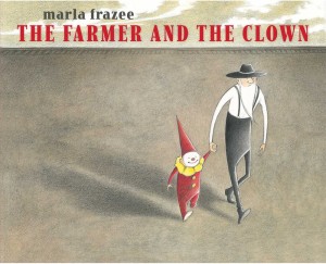
It's time to talk about a book that's been one of my favorites all fall: Marla Frazee's The Farmer and the Clown.
I find it difficult not to gush over this book. It is so simple and yet so profound: the classic "stranger comes to town" story brilliantly re-imagined and re-visioned. It works for me on both an intellectual and emotional level, so much so that I can start out discussing the composition of a particular page, say, and end up talking instead about the definition of family; love and loss. The search for belonging. What happens when we reveal our true selves to others. You know, the whole human condition.
So to prevent me going off the deep end, I'll stick to bullet points and simply highlight some of the strengths of the book; some of the things that make it worthy of Caldecott consideration. I hope you will help me fill in the gaps in the comments.
- THE EXPRESSIVENESS of the characters, through body language and facial expressions. To quote the Horn Book "Fanfare" citation: "Rarely has posture been used so well in a picture book, here used to wordlessly portray the kindness of strangers who are thrown (literally!) together by happenstance but then changed forever."
- THE TENSION. The story itself has built-in tension — how are these seemingly opposite characters going to get along? will the farmer be able to comfort the child? will this be the child's new home, or will the circus train come back? — so does the visual storytelling. As a reader/viewer I am pulled in two directions. I want both to linger over each spread to catch every nuance AND to turn the page to see what happens next. The picture book storytelling is perfectly balanced here.
- THE LANDSCAPE. This has got to be one of the sparest landscapes ever depicted in a picture book. The horizon stretches unendingly beneath vast skies. There is no vegetation aside from the one tree on the one knoll. There aren't even any haystacks to break up the emptiness (though there seems to be plenty of hay to make them with). The color palette is equally austere: brown, sere, desert-like. Does the empty landscape echo and make manifest the heart of the farmer? Or does it serve to keep the viewer's focus on the characters, their interactions and emotions? I would say both.
- THE ENDING. It is just open-ended enough. You close the book satisfied but also with a little room to fill in details yourself. It's not the mind-blowing, drop-the-reader-off-a-cliff ending of Sam and Dave Dig a Hole. But the questions asked by the ending can be answered by a the story you've just finished reading. It's a very organic, very satisfying kind of open-endedness. The answers are all in the spot illustration on the last page: in the farmer's posture (relaxed, upright, hands in pocket — he's contemplative, but not unhappy), in the hat he's wearing, the hat HE chose to swap with the little clown; and of course in the presence of the circus monkey, the same size and shape and dressed the same way as the departed little clown.
- THE MULTILAYEREDNESS of the wordless narrative. One of the most brilliant parts of the book is the very first page where Frazee uses a clean white background rather than that mottled sere brown — the page just after the little clown has been jettisoned from the train. Read it one way (with makeup in place): a little clown seeks to entertain an audience. He does a little dive move, he doffs his cap, he takes a bow. All part of a performance. BUT. Read it another way (if one could see through the makeup to the scared baby/toddler beneath): he points desperately to where he came from; he mimics how he fell from the train, he bends over in despair; he runs to the farmer to plead for help. I'm not sure I know of another picture book that accomplishes this layered interpretation.
- THE VISUAL LINKS BETWEEN THE CHARACTERS. There are many. Even when they look like complete opposites — tall skinny old farmer all dressed in black; short round young child all dressed in red — there is a relationship between them. Note the reverse symmetry of the small clown and the tall farmer: the clown's tall pointy hat is the farmer's long pointy beard, in reverse; the clowns horizontal ruffle around his neck is the farmer's flat hat on his head. Then when the truth comes out and the little clown's true self is revealed, the link becomes closer and nearer: we see their equally bald heads, and the farmer's red long johns match the child's red clown suit. And at the very very end, the link between them is cemented when the farmer swaps their hats, placing his black hat on the toddler's head and donning the tall red cone hat himself.
- THE STORY'S DEPTH. This would have been just a sweet little story of friendship and love/loss/love…but the addition of the painted-on smile of the little clown asks SUCH deeper questions and adds so many deeper layers. And so by the end of the book, this reader, anyway, is entirely emotionally invested. Look at that oversized arm on the final double-page spread (the long horizontal arm balanced compositionally by the long horizontal train, by the way). Is the farmer's arm waving goodbye? or reaching out, trying to hold on? There's a phenomenal amount of feeling in that disembodied arm. I am not sure many other artists could invest so much emotion in an ARM.
I've heard that The Farmer and the Clown doesn't work for two- and three-year-olds. Well, no. Is it supposed to? Do people think that because the clown is a very young child, the book also must be for very young children? The age of the baby/toddler clown does not determine the audience for this book. It's for reader-viewers who are interested in determining and decoding the situation, reading the postures, the facial expressions, watching the specific yet universal story unfold.
And no, it's not all that funny. Again, is it supposed to be? I am not sure that all Marla Frazee books have to be laughfests. The book does have small moments of humor (the juggling eggs sequence, for instance), but it's the kind of humor that might evoke a smile rather than a guffaw. I think readers are too involved in the pathos of the situation, the drama, the tension, to want or need to do a lot of giggling. But since the Caldecott committee is charged with looking only at the books of 2014, a comparison to Frazee's earlier work should not apply.
Can the Caldecott committee ignore their expectations of what a Marla Frazee picture book should be? Will they see the genius of this book?
RELATED
RECOMMENDED
ALREADY A SUBSCRIBER? LOG IN
We are currently offering this content for free. Sign up now to activate your personal profile, where you can save articles for future viewing.


Add Comment :-
Comment Policy:
Comment should not be empty !!!
Even in Australia
I guess I'm in the minority too, but I found this book - to use an imprecise term - simply creepy. Why a clown? Why not just a child? Why does the farmer look Amish? I love much of Marla Frazee's work but not only doesn't the story resonate with me here, the art doesn't either.Posted : Jan 12, 2015 04:35
Teresa
"And so by the end of this book, this reader, anyway, is entirely emotionally invested." This reader, too. I love this book, and I cannot wait to look through it again and study that arm. How did I miss it? Thank you for this review that summed up exactly how I feel about The Farmer and the Clown, but could never express so eloquently.Posted : Dec 19, 2014 12:07
Rebecca
If they (the committee) don't see the absolute genius of this book, it's a crying shame. It is my top pick for the Caldecott this year.Posted : Dec 18, 2014 04:25
Sam Juliano
THE FARMER AND THE CLOWN is certainly a beautiful book, and I'd reckon that if oddsmakers were to offer a betting line, this book would probably be established as the favorite, much for the reasons so wonderfully expressed in this banner post, and also because the ALA just loved Frazee. This sentiment remains applicable for me, even with the understandable unwritten rules that past awards are not to be used for or against the illustrator. Over the past years wordless books have done very well. There is a deep melancholic underpinning in this book that won't allow for any sustained laughter. The use of red and yellow is striking. The vignettes have emotional depth, and the entire idea is inspired. Yes I do quite understand why the Horn Book staff is over the moon on this one. Without question one of the finest picture books of 2014. Again a stupendous review. :)Posted : Dec 18, 2014 12:58
Jess
I loved this the first time I read it. I loved it more the next time. And the next, and the next...basically, I want to reread this book every time I think about it! But of course that doesn't make it award-worthy - what does is that expressiveness, that perfect pacing, the way you can read so much into the pictures, the use of color and movement and white space. There's nothing extra, each moment serves its purpose.Posted : Dec 18, 2014 12:43