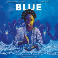
Calling Caldecott dives into Blue: A History of the Color as Deep as the Sea and as Wide as the Sky, illustrated by Daniel Minter.
[As promised, most Calling Caldecott posts this season will begin with the Horn Book Magazine review of the featured book and then segue into the post's author's critique.—MVP]
 Blue: A History of the Color as Deep as the Sea and as Wide as the Sky
by Nana Ekua Brew-Hammond; illus. by Daniel Minter
Primary Knopf 40 pp. g
2/22 978-1-9848-9436-6 $18.99
Library ed. 978-1-9848-9437-3 $21.99
e-book ed. 978-1-9848-9438-0 $11.99
This wide-ranging nonfiction picture book explores the many facets of a single color, dipping a brush into culture, history, linguistics, art, science, and more. Brew-Hammond begins with a historical look into the different ways people around the world made the title hue and how the difficulty of those methods influenced the color’s early cultural meaning, causing it to be associated with luxury and royalty. After introducing the discovery, in 1905, of a chemical that made blue items (fabrics, etc.) more easily available, Brew-Hammond explores how the history of the color has even influenced language, as when people talk about “the blues” or why first prize is often a blue ribbon. Minter’s illustrations — “layers of acrylic wash on heavy watercolor paper” — use textures such as patterned West African indigo cloth and mottled clouds in the sky, but blue is often not the predominant color on the page. Large expanses of contrasting colors make the blues pop; the illustration accompanying a discussion of the cruelty of the indigo trade, for example, features the hot reds and yellows of the landscape, against which enslaved people and indentured farmers (painted in deep indigo) toil. Blue has, in Brew-Hammond’s words, “a complicated history of pain, wealth, invention, and recovery,” and exploring that history will make readers look at the color in a new way. Back matter includes additional facts and sources. Pair with Tamaki’s They Say Blue (rev. 7/18) and Brown and Dunn’s Perkin’s Perfect Purple (rev. 9/20). LAURA KOENIG
From the January/February 2022 issue of The Horn Book Magazine.
I'm excited to start the season with a nonfiction picture book. It's a truism at this point, but the days of serviceable, generic illustration in picture-book NF are long gone. There are a number of nonfiction titles on the CC to-do list this year, all worthy of Caldecott consideration.
The subject of this book is the color blue, which is not only a color but also an emotion, and a value, which means that the illustrations must do a lot. Daniel Minter's art meets the challenge.
Minter previously earned a Caldecott Honor for Going Down Home with Daddy, by Kelly Starling Lyons — a very different book, but with similar use of watercolor washes and the incorporation of symbols and patterns.
With this book's text referencing the sky and sea, I appreciate that Minter begins with double-page spreads in which the color blue predominates. These opening pictures serve to immerse the reader in the subject (and indeed we see children floating in the sky). But as the text delves into how rare it was to find blue in nature, historically, and how difficult it was for humans to produce the color, Minter steps away from those blue-saturated pages, introducing other colors, highlighting how very rare blue was. As the text takes us through the history of blue, Minter provides a through line with the inclusion of patterns — on clothing; to represent the rays of the sun, the continents, even chemical bonds; to convey emotion.
The most powerful illustration (for me) is the one reviewer Laura Koenig refers to above about the cruelty of the indigo trade. On the previous spread the text says, "Indigo became so precious, people spent it like money." So readers are set up for the impact when they turn the page to see a double-page expanse of red fields and yellow sky, with the people toiling in the field the only objects in the illustration colored a deep indigo blue. Minter VISUALLY shows readers how a person reaping indigo was literally equated with money; less human than commodity.
I hope some of you have had the chance to see Blue. If you were serving on the current Caldecott committee, what arguments might you be making in its favor, or otherwise? I see a bit of a tonal change in the book's later pages, notably on the spread that discusses blue as a value. The art seems a bit flatter, less complex (though I do appreciate the fact that the blue ribbon's recipient is a young Black girl who has won first prize at her science fair) — do you think that shift works? And for those without the book in front of you, what were your overall impressions?
RELATED
ALREADY A SUBSCRIBER? LOG IN
We are currently offering this content for free. Sign up now to activate your personal profile, where you can save articles for future viewing.


Add Comment :-
Comment Policy:
Comment should not be empty !!!
Susan Dailey
I'm blown away by Minter's use of hands and his ability to draw them! The layering in the spreads is also notable. I'm not sure what I think about the varying styles in the book. An example is found on the first double-page spread where the hands are realistic while the children are less so. I wonder while Minter made this choice.Posted : Oct 06, 2022 12:09