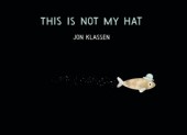
By now everyone knows the news: This Is Not My Hat won the Caldecott and the committee chose five honor books. Oh happy day for these two bloggers who like a generous honor book slate!


Winner:
This Is Not My Hat by Jon Klassen
Honor Books:
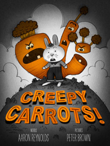
Creepy Carrots by Aaron Reynolds, illustrated by Peter Brown
Extra Yarn by Mac Barnett, illustrated by Jon Klassen
Green by Laura Vaccaro Seeger
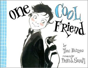
One Cool Friend by Toni Buzzeo, illustrated by David Small
Sleep Like a Tiger by Mary Logue, illustrated by Pamela Zagarenski
We covered three of these books early in the fall (links to those posts above). Two others, One Cool Friend and Sleep Like a Tiger were on our list to talk about if we had time. Now it's time for us to take a look at all six and go on the record with our response.
Before we get there, though, it's worth taking a look at who these winners are.
The biggest news is that for only the second time in Caldecott history, one artist will get both the win and an honor book. (Thank you, Susan Dalley, for checking this.) I can only imagine what kind of day Jon Klassen had yesterday! And, since I've been hearing a lot of people say his name over the past two days, it's worth noting that we learned at the Boston Globe-Horn Book Awards that he actually pronounces his last name "Klawsen."
Among the honor book winners, Peter Brown is relatively new to the picture book scene and while he has received quite a bit of attention, this is the first time he's been honored by the Caldecott committee. Laura Vaccaro Seeger has been making picture books for just over ten years and got a Caldecott honor for First the Egg in 2008. David Small has had the most Caldecott love, with a win in 2001 (So You Want to Be President?) and honor book in 1998 (The Gardener). Pamela Zagarenski has been making picture books for about as long as Peter Brown and received a Caldecott honor in 2010 for Red Sings from the Treetops.
Now it's time to talk about what think of the committee's choices. (Robin says she'll weigh in via the Comments.)
First off, I was amazed that Z Is for Moose didn't get ANYTHING. It was in my personal top three, but the main reason I'm surprised is because it seemed to rank pretty high on a lot of other Mock Caldecott lists. I was so sure it would at least get an honor. How I would like to know what went on during that discussion. There might have been a strong voice of dissent in the room or a general lack of interest. I don't think we can say it's because the book seems too silly because this committee chose Creepy Carrots which is only slightly less silly than Moose, and certainly less thought-provoking. It's a puzzler for me, and we'll never know the answer. My consolation is that Paul Zelinsky has created a terrific Moose cover for our March/April Horn Book Magazine special issue on the theme "Different Drummers." He also figures prominently inside the issue with an appreciation by Barbara Bader.
Another thing that strikes me about this list is that most of these books have what you might call a limited palette. Or at least a subdued palette. While they are all printed in four colors (CMYK), Green is kind of sort of more-or-less a one-color book; Creepy Carrots is predominantly black and orange; and One Cool Friend leans heavily toward a retro color separation look with its use of flat light blue. Jon Klassen's books use lots of colors, but they are tempered by the amount of white space (in Extra Yarn) and black space (in This Is Not My Hat). I think Klassen's choice to use a fairly limited palette for the backgrounds in Extra Yarn was a smart one since it allows the multicolored yarn to take center stage. I have a lot of respect for all four of these books. Caldecott Committee, I approve.
So that leaves Sleep Like a Tiger. This is a book I looked at early on, found to be mysterious and fascinating, and kept meaning to come back to. I'm really sorry I didn't find the time because I would have made certain to write a post about it. If you don't know this book yet, it's a bedtime book about a girl who insists that she is not sleepy. Not exactly a new idea. The text is quite lovely and her parents seem to know just how to handle the situation.
But the art -- wow! We learn much more about the characters through the art than we do in the text, but at the same time Zagarenski's imagery brings up as many questions as it answers. Why are they wearing crowns? Are they royal? Why is the mother holding The Little Prince? What is the significance of whales (a white whale, no less), and why does it have wheels? A visit to Pamela Zagarenski's website doesn't give many answers, and if you know her other books then you are aware that crowns and wheels show up willy nilly throughout her art. There's a lot of thinking going on behind these images, and also plenty of emotion. It just works. I could go on and on, but just one more thing: notice how much detail there is in the earlier pictures before the little girl starts to give in to sleep, then watch as the images become less and less busy. They're still rich and mysterious but there's more breathing room. Just like falling asleep at last.
So there you go. That's my take on these books.
Your turn!

Add Comment :-
RELATED
ALREADY A SUBSCRIBER? LOG IN
We are currently offering this content for free. Sign up now to activate your personal profile, where you can save articles for future viewing.


